The best brand guidelines examples aren’t the flashiest PDFs. They’re the ones with clear logo math, honest color specs, and voice rules written in plain English. This roundup collects the strongest public brand guides, including NASA, Slack, Spotify, and Dow, then hands you a copyable template. Pick three examples to save, then run the checklist in this article against your own brand today.
TL;DR:
- Clear logo specifications, precise color codes, and voice guidelines in plain English are the hallmarks of effective brand guides.
- Public examples like NASA, Slack, Spotify, and Dow demonstrate best practices such as formula-based rules, tone contrast, misuse examples, and governance.
- A comprehensive guide covers logo variations, exact color palettes, typography, imagery, voice, templates, and ownership details to prevent brand drift.
- Linking to downloadable assets and using a structured template ensures the guide is useful, accessible, and easy to update.
- Scaling a brand guide should match team size, with smaller teams requiring simplified versions and larger organizations needing detailed governance and accessibility sections.
Table of Contents
- Brand Guidelines Examples Worth Studying (And What Each One Teaches)
- What Makes a Brand Guide Genuinely Great
- The Brand Guide Template: What to Actually Include
- Rolling Guidelines Out Without Creating Chaos
- How Courimo Turns a Brand Guide Into a Live Website
- Short Guide or Exhaustive Manual? Pick Based on Team Size
- Courimo’s Branding and Web Implementation Services
- Public Brand Guides Worth Bookmarking
- Sources
- FAQ
Brand Guidelines Examples Worth Studying (And What Each One Teaches)
Every guide on this list is public, meaning you can open it right now and reverse engineer it. Rather than just admiring the design, treat each one as a lesson in a specific skill: logo math, voice discipline, modular systems, co-branding, or accessibility.
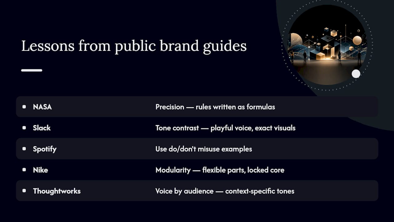
1. NASA Graphics Standards Manual. The NASA manual is famous for a reason: it defines the “worm” logotype with precise grid construction, angle specifications, and a strict list of approved colors. The lesson here is precision. When a rule can be reduced to a formula (a specific angle, a specific ratio), write it as a formula, not a description.
2. Slack Brand Guidelines. Slack’s online brand center pairs a playful voice with rigid technical specs for its “hash” mark, including clear space and minimum sizing. The takeaway is tone contrast: a guide can sound conversational in the writing sections while staying exact in the visual sections. Those two registers do not have to fight each other.
3. Spotify Brand Guidelines. Spotify’s guide leans hard into “do” and “don’t” visuals for its green (officially specified as Pantone 802 C or the hex equivalent) and shows dozens of logo misuse examples side by side with correct usage. Explicit misuse examples like this measurably improve how consistently outside designers apply a brand’s rules, because nobody has to guess what “wrong” looks like.
4. Netflix Brand Guidelines. Netflix keeps its public guide tight, focused almost entirely on the “N” mark, the wordmark, and a short list of approved treatments. The lesson: restraint. A single-property brand doesn’t need forty pages, and padding a slim guide to look more serious usually backfires.
5. Nike Brand Identity Guidelines. Nike’s internal-style guidance (portions of which circulate publicly) treats the Swoosh less as a static logo and more as a modular system, adjustable across apparel, digital ads, and retail signage while staying recognizable. The lesson is modularity: define the parts of your identity that can flex, and lock down the parts that can’t.
6. Starbucks Creative Expression Guidelines. Starbucks documents seasonal and regional variation of its siren logo alongside firm rules for when the mark must appear untouched. That balance, flexible in application, fixed in core structure, is worth copying if your brand shows up across multiple markets or seasons.
7. Thoughtworks Brand Guidelines. Thoughtworks, a global technology consultancy, writes its voice and tone rules by audience: how the brand sounds in a technical blog post versus a recruiting page versus a client proposal. That’s a lesson most small businesses skip. Voice isn’t one setting; it’s several, tied to context.
8. Dow Brand Guidelines. Dow’s October 2025 brand guide is close to a masterclass in enterprise scale. It includes full Pantone references alongside RGB and CMYK, dedicated ADA and WCAG compliance sections, image licensing rules, and a governance checklist for how updates get approved. If you’ve ever wondered what “comprehensive” actually looks like on paper, this is it.
9. NPR Brand Guide. NPR’s public brand guide spells out co-branding rules in detail: how to handle trademark symbols, how much clear space a partner logo needs, and how to keep NPR’s mark visually independent when it shares space with a local station’s identity. Any brand that partners, sponsors, or licenses its name needs this exact kind of specificity.
10. Hulu Brand Guidelines. Hulu’s identity system documents a flexible color story built around its signature green, with clear rules for when the wordmark can shift tone for a promotional campaign versus when it must stay locked to the standard palette. The lesson: campaigns can bend the brand, but the guide has to say exactly how far.
Vendor archives like BrandingStyleGuides and roundups like Frontify’s list of 19 examples are worth bookmarking too. They index dozens more public PDFs beyond this list, organized by industry, which is useful once you’ve absorbed the lessons above and want more reference points in your specific category.
What Makes a Brand Guide Genuinely Great
Length has almost nothing to do with quality. A great brand guide is judged on five things: how fast someone unfamiliar with the brand can find an answer, how completely it covers the elements that actually get misused, whether files are attached or just described, whether it accounts for accessibility, and whether anyone owns keeping it current.
Coverage matters most. A usable brand guide typically nails logo variations, a color palette with exact codes, a typography system, photography or illustration direction, and voice and tone guidance. Miss one of those five and someone downstream will improvise, which is exactly how a consistent brand starts drifting after six months.
Dow’s guide earns its length by pairing every rule with a reason: color specs sit next to ADA and WCAG contrast guidance, not buried in a separate accessibility appendix nobody reads. NPR earns points for governance clarity: co-branding rules state exactly how much visual weight each partner gets, removing the awkward negotiation that usually happens over email.
File access is the most underrated criterion. A guide that only shows a logo as a flattened image in a PDF is a guide nobody can actually use. The best examples link directly to downloadable SVGs, layered files, or a brand-center asset library, so applying the rule takes minutes, not a request to the design team.
The Brand Guide Template: What to Actually Include
Copy this structure into a PDF, Notion doc, or design file and you have a working brand manual, not just a mood board. Each section needs specific fields filled in, not vague notes.
- Logo system: primary mark, secondary/lockup versions, minimum clear space (in exact units), minimum size for print and digital, and a “don’t” grid showing stretching, recoloring, and low-contrast misuse.
- Color palette: hex and RGB for digital, CMYK and Pantone for print, plus a usage ratio (e.g., 60% primary, 30% neutral, 10% accent) and WCAG contrast ratios for text-on-color combinations.
- Typography: primary and fallback font stacks, defined size scale for headings and body text, and line-height rules for web versus print.
- Imagery and iconography: photography mood direction, illustration style if applicable, and icon grid rules.
- Voice and tone: three to five adjectives the brand should sound like, paired with a short “sounds like / doesn’t sound like” example for each, split by context (marketing copy, support replies, internal memos).
- Application templates: sample layouts for business cards, social posts, email signatures, and slide decks so the system is proven in real formats, not just theory.
- Governance: version number, last-updated date, and the name or role responsible for approving changes.
On file delivery: name files consistently (logo-primary-rgb.svg, logo-primary-cmyk.eps), store the master set in one shared drive or a tool like Frontify, and never let the “current” version live only on one person’s desktop.
Rolling Guidelines Out Without Creating Chaos
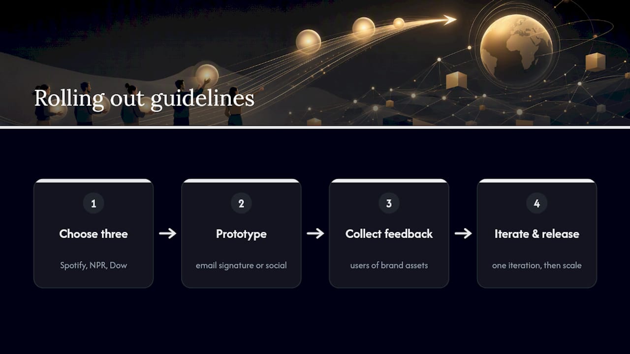
Don’t try to apply forty rules on day one. Pick three from the examples above (say, Spotify’s misuse grid, NPR’s co-branding clause, and Dow’s contrast rule), prototype them in a single channel like your email signature or one social template, then get feedback from whoever actually uses brand assets day to day. Iterate once before rolling wider.
Scale changes what “enough” looks like. A five-person team needs a tight one-pager: logo files, three colors, one font pairing, and a short voice note. A 50-location franchise needs the Dow-style version, with governance, accessibility, and co-branding sections, because more people means more room for drift.
Two reminders that get skipped constantly: check color contrast against WCAG standards before finalizing any palette, and build a translated lockup for every language your brand operates in, since a wordmark that looks balanced in English can break entirely in German or Arabic.
How Courimo Turns a Brand Guide Into a Live Website
Once a guide exists, someone has to turn it into working code, and that’s where most brand documents stall. A typical process runs in four steps: audit the existing guide (or help build one if none exists), convert colors and type into reusable web tokens like CSS variables, produce the actual asset package, then QA every touchpoint against the source file.
Deliverables typically include exported logo files in every needed format, a token sheet developers can drop straight into a stylesheet, and starter templates for social, email, and presentations. One pattern shows up consistently across projects: teams that hand over a real template package, rather than a static PDF, cut review cycles dramatically because designers stop guessing at hex codes.
Short Guide or Exhaustive Manual? Pick Based on Team Size
A guide should be as long as your team’s coordination problem, no longer. A solo founder needs a page, not a manual; a 50-person team without one risks real inconsistency. Set an update cadence (quarterly review works for most) and name one clear owner, because a brand guide nobody maintains becomes wrong within a year.
Courimo’s Branding and Web Implementation Services
Courimo builds the bridge between a finished brand guide and a website that actually reflects it. That gap, a beautiful PDF sitting unused while the live site still uses last year’s colors, is one of the most common branding failures small businesses run into, and it’s exactly the problem website development work is built to close.
Services may include logo creation, color and typography implementation, and full site builds that align closely with brand guide specifications. If your brand guide (new or inherited) needs to become a real website, request a project estimate to explore digital implementation options.
Public Brand Guides Worth Bookmarking
- Shopify’s brand guidelines template: the clearest walkthrough of core sections and page-length benchmarks.
- Frontify’s 19 examples roundup: curated public brand centers with annotated lessons.
- Dow’s brand guide PDF: the benchmark for enterprise-scale detail and accessibility.
- NPR’s brand guide PDF: the strongest public example of co-branding rules.
- BrandingStyleGuides archive: a searchable library of additional public PDFs by industry.
Sources
- How To Create Brand Guidelines: Simple Brand Guide Template (2025) – Shopify
- 19 Brand Guidelines Examples To Inspire Your Own — Frontify
- Brand Guidelines Strategic, Visual and Verbal Direction to Support the Dow Brand — Dow (Oct 2025)
FAQ
How do I write brand guidelines?
Start by documenting your logo’s exact specs (clear space, minimum size, color codes), then add typography, imagery direction, and voice rules organized by context. Use the template checklist above as your section list, and include misuse examples for anything prone to misapplication.
What are the best brand guidelines to study right now?
Dow’s guide is the strongest reference for enterprise-scale detail, including accessibility and governance sections, while NPR’s guide is the best public example of co-branding rules. Slack and Spotify are worth studying for how they balance a casual voice with precise visual specs.
What are the most common branding strategies brands rely on?
Definitions vary across sources, but recurring strategies include building a distinct visual identity, defining a consistent voice and tone, modular logo systems that flex across contexts, co-branding and partnership rules, accessibility-first color choices, and clear governance for keeping the brand current.
What does it mean to have brand guidelines?
Brand guidelines are the reference document that defines how a company’s logo, colors, typography, imagery, and voice should appear across every touchpoint. Their job is to keep a brand looking and sounding consistent whether a freelancer, an internal team, or a partner organization is producing the material.
Do small businesses actually need formal brand guidelines?
Yes, even a one-page version helps once more than one person touches marketing materials. A small business guide can cover just the logo, three brand colors, one font pairing, and a short voice note, and still prevent most of the inconsistency that shows up as a brand scales.