A landing page is a single-purpose page built to get one visitor to complete one action. Get that right first, and everything else, colors, copy, form length, follows from it. The single rule that separates high-converting pages from the rest is message match: the headline has to echo whatever ad, email, or link sent someone there, with zero competing navigation. Before you touch anything else, check three things: does the headline make sense in 5 seconds, is the CTA visible without scrolling, and does the page load fast on a phone.
TL;DR:
- Message match between ad and landing page headline is critical, with the headline making sense within five seconds and the CTA visible without scrolling.
- The most effective landing pages focus solely on one action, featuring a hero section, proof, benefits, a clear process, objection handling, and a final CTA, prioritizing the hero above all.
- Visual hierarchy and fast mobile load times significantly impact conversions, with large, contrasting CTAs and simple, mobile-first layouts outperforming cluttered designs.
- Short, outcome-focused forms with minimal fields, and alternative contact methods like click-to-call or booking widgets, boost lead capture efficiency.
- A/B testing should prioritize headline and CTA changes first, with tests running until statistical significance is achieved, and problems often fixable through small, quick adjustments rather than complete redesigns.
Table of Contents
- What Is Landing Page Design, and What Makes One Actually Work?
- Landing Page Examples and Templates Worth Stealing
- Design Principles That Actually Move the Conversion Rate
- Landing Page Copywriting: Headlines, Subheads, and CTAs That Convert
- Form Design: How Many Fields Are Too Many?
- Mobile-First Layout and Page Speed: The Launch Checklist
- A/B Testing Your Landing Page: What to Test First
- Landing Page Builders and Templates: DIY or Hire It Out?
- How a Digital Agency Approaches a Landing Page Project
- SEO Basics That Affect Landing Page Visibility
- Common Landing Page Mistakes Worth Catching Early
- The Psychology Behind Why Landing Pages Convert
- Get a Landing Page Built to Convert, Not Just Look Good
- Test First, Rebuild Only When Testing Can’t Fix It
- Where This Guide’s Data Comes From
- Sources
- FAQ
What Is Landing Page Design, and What Makes One Actually Work?
Landing page design is the practice of arranging a single web page around one conversion goal, stripped of the distractions a normal website page carries. No main navigation menu, no footer full of links to other products, no “learn more about our company” sidebar. Every pixel either moves the visitor toward the CTA or gets deleted.
That single-purpose focus is what separates a landing page from a homepage. A homepage has to serve ten different visitor intents at once. A landing page serves one. Visitors form a judgment about whether a page is relevant to them within the first several seconds of arrival, and on landing pages specifically that window is often closer to 5 seconds, according to research cataloged by Dribbble. If your hero section hasn’t communicated the value and the next step in that window, the rest of the page rarely gets a chance.
Here’s the anatomy that shows up again and again on pages that convert well, in the order visitors actually scroll through it:
- Hero section: headline, subheadline, and CTA button, all visible without scrolling. This is the whole pitch in miniature.
- Credibility moment: a row of client logos, a press mention, or a short testimonial placed right after the hero, before you’ve asked for anything.
- Benefits block: three to five scannable statements about outcomes, not features. “Get paid three days faster” beats “automated invoicing module.”
- How-it-works sequence: three or four numbered steps that show the process is simple and low-risk.
- Objection handling: a short FAQ or a guarantee that answers the hesitation you know is coming.
- Closing CTA: a second, final ask, usually paired with one more piece of proof.
The hero section carries more weight than any other part of the page, because it’s the only part every visitor sees. The headline states the outcome, the subheadline adds the specific detail or timeframe, and the CTA button is the one and only clickable action competing for attention. Anything else up there, a second link, an unrelated image carousel, a chat widget popping up immediately, competes for the same five seconds and usually loses you the visitor.
Credibility placement matters more than people expect. Testimonials tucked at the bottom of a long page do almost nothing, because most visitors never scroll that far. Specific, attributed proof, a name, a role, a real result, placed right after the hero or right beside the form, works because it answers the unspoken question “can I trust this?” at the exact moment the visitor is deciding whether to keep reading. Vague testimonials (“Great service!”) do less work than one sentence with a name and a number attached, a pattern confirmed across data-backed conversion research.
The benefits section is where most pages waste their best real estate. Feature lists (“cloud-based dashboard, real-time sync, API access”) describe the product. Benefit lists describe what changes for the visitor. Rewrite every bullet as an outcome and you’ll usually see the page read faster and hit harder.
The how-it-works block exists to lower anxiety, not to explain your product in depth. Three steps, plain language, maybe a small icon each. This is the section that turns “I’m interested but nervous” into “okay, I get it, that’s not complicated.” Skip it and you leave that anxiety unaddressed right where the form is asking for a decision.
Every one of these elements exists to answer one question the visitor is silently asking at each scroll depth: why should I keep going, and can I trust what happens next? Courimo’s own breakdown of why landing pages matter covers the campaign-level thinking behind this structure in more depth.
Landing Page Examples and Templates Worth Stealing
Inspiration works better than theory when you’re staring at a blank page. Here are the patterns that show up across strong landing pages in different categories, along with what to copy and what to skip.
- SaaS free trial page. The hero pairs a specific outcome headline (“Cut invoice processing time in half”) with a product screenshot showing the actual dashboard, not a stock photo of people smiling at laptops. The CTA says “Start Free Trial,” not “Submit.” What makes it work: the screenshot does the selling, because SaaS buyers want to see the interface before they commit ten minutes to a demo call.
- Ecommerce flash sale page. A countdown timer sits directly under the headline, product photography is shot at multiple angles, and the discount percentage is the biggest text on the page after the product name. Urgency here is honest, the sale has a real end date, which matters because fake countdown timers get noticed and erode trust fast.
- Webinar registration page. The form asks for name and email only. A calendar-add button appears immediately after signup, and a single line of copy states the exact date, time, and what attendees will walk away knowing. Reminder emails are set up before the visitor even leaves the confirmation screen.
- B2B demo request page. This one earns its length. Value props appear first, then a proof section with two or three customer logos, then an explanation block describing what happens during the demo call, and only then the form. Enterprise buyers need more convincing before they’ll hand over contact information, which is a different job than a newsletter signup, according to guidance from LanderLab’s best-practices research.
- Local service quote page. Short hero, a phone number prominent in the header for click-to-call, and a simple three-field form below the fold for people who’d rather type than talk. Both paths lead to the same conversion goal.
- App download page. Hero shows the app on a phone screen, mid-use, not a static icon. Two buttons for App Store and Google Play sit side by side under the headline, and a short row of star ratings sits right beneath them.
- Consulting or coaching booking page. A calendar embed replaces the form entirely. No “we’ll be in touch,” just pick a slot. This removes an entire step of friction for anyone who’s already decided they want to talk to someone.
Two structural templates cover most of what you’ll build:
- Click-through pages send visitors toward a purchase or signup on another page, mostly used for ecommerce and app installs, where the “form” is really just a button.
- Lead-generation pages collect contact information directly on the page through a form, used for demos, quotes, and webinar signups.
Building your own swipe file is simpler than it sounds. Screenshot any landing page that makes you actually want to click, drop it into a folder, and write one line underneath explaining why it worked on you specifically. After a dozen examples, patterns start repeating: certain headline structures, certain CTA phrasing, certain proof placements. That’s your personal template library, and it’ll teach you more than any generic checklist because it’s built from pages that moved you.
Design Principles That Actually Move the Conversion Rate
Visual hierarchy decides what a visitor looks at first, second, and third, and on a landing page that order should never be an accident. The headline should be the largest text on the page. The CTA button should be the second-most visually dominant element. Everything else, body copy, images, secondary links, sits below both in size and contrast.
Whitespace does more work than most builders give it credit for. A cramped page with five competing elements per screen forces the eye to hunt for the CTA. Generous margins around the button and the headline make both easier to spot instantly, which matters given how little time visitors give a new page before deciding whether to stay.
CTA color needs contrast, not necessarily a “conversion color.” A bright orange button on a mostly blue page works because it stands apart, not because orange has magic properties. Size matters too: the button should be large enough to feel like the obvious next step, not a small text link buried in a paragraph. On mobile, that translates into a touch target of at least 44 by 44 pixels, the minimum Apple’s own accessibility guidance recommends for anything a thumb needs to hit reliably.
Hero visuals fall into three categories, and each fits a different offer:
- Product screenshots work best for software, where seeing the interface reduces uncertainty about what you’re buying.
- Product-in-use photography works for physical goods and lifestyle offers, showing the item solving a real problem.
- People-focused imagery works for services and coaching, where trust in a person matters more than trust in a tool.
Picking the wrong one is a common miss: a SaaS page with a stock photo of a handshake tells the visitor nothing about what the software actually does.
Accessibility improvements tend to double as conversion improvements, which is worth remembering when a deadline makes accessibility feel optional. Sufficient color contrast between text and background helps low-vision visitors and also helps everyone read faster under bad lighting or a cracked screen. Touch targets sized for thumbs help visitors with motor impairments and also help anyone to try to tap a button on a crowded bus. Alt text on images helps screen readers and also gives search engines more context about the page. None of this is charity work; it’s friction removal that happens to be measured in accessibility guidelines.
Performance-minded design means resisting the urge to add a full-screen video background or six embedded fonts because they look impressive in a mockup. A slightly plainer page that loads in under two seconds will often out-convert a heavier, more polished one that takes five, a pattern that shows up consistently across conversion-focused design research. Speed is a design decision, not just a developer’s problem.
Pro Tip: Before you finalize any layout, squint at your screen or blur your eyes slightly. Whatever still stands out clearly, that’s your real visual hierarchy. If the CTA disappears into the blur, it’s not dominant enough.
Courimo’s overview of critical elements for a powerful website covers several of these hierarchy and layout principles in the context of full site builds, which carries over directly to single landing pages.
Landing Page Copywriting: Headlines, Subheads, and CTAs That Convert
Headlines that convert follow a simple formula: state the specific outcome, add the timeframe or mechanism, and skip the cleverness. “Get More Leads” says nothing. The formula is Outcome plus Specificity plus where honest, a number.
Message match is the part writers skip most often. If a Facebook ad promises “50% off your first order,” the landing page headline needs to say the same thing in the same words, not “Welcome to Our Store.” Any gap between what someone clicked and what they land on reads as a bait and switch, even when it isn’t one, and it’s one of the most reliable conversion killers according to research from LanderLab. Personalizing that headline further, swapping in the visitor’s industry, city, or search term where dynamic text allows, pushes performance even higher; HubSpot has found personalized CTAs can outperform generic ones by over 200% in some tests, according to HubSpot’s landing page research.
CTA copy works best as action plus outcome, not just an action. Compare these:
- “Submit” tells the visitor nothing about what happens next.
- “Get My Free Quote” tells them exactly what they’ll receive.
- “Start My 14-Day Trial” adds a timeframe that makes the commitment feel bounded.
- “Book My Strategy Call” personalizes the action with “my,” a small word that measurably increases click rates in split tests.
Subheadlines exist to answer the question the headline raises. If the headline is the promise, the subheadline is the proof or the mechanism: “Get More Leads” as a headline paired with “Our automated follow-up system re-engages cold leads within 24 hours” as a subhead gives the visitor a reason to believe the claim.
Microcopy, the small lines near a form or button, does quiet but real work reducing anxiety at the exact point of decision. A line like “We never share your email” next to a signup field, or “No credit card required” under a trial button, removes the specific hesitation that stops a finger from clicking. Courimo’s guide on improving your website’s CTA walks through more of these small-copy tactics in detail.
Form Design: How Many Fields Are Too Many?
Fewer fields convert more visitors, and the drop-off from adding just one extra field is bigger than most builders expect. Cutting a form from four fields down to three can raise conversions by roughly 50%, and trimming an eleven-field form down to four produces even larger gains, according to HubSpot’s form-length research. Every field is a small tax on the visitor’s patience, and most of them aren’t worth collecting at this stage anyway.
For most offers, the minimum viable form looks like one of these three:
- Email only, for newsletter signups or low-commitment content downloads.
- Email plus name, for gated resources like ebooks or webinar registration.
- Email plus phone, for service businesses where a follow-up call is the next real step.
Anything beyond that should earn its place. If you genuinely need job title, company size, or budget range to qualify a lead, consider progressive profiling instead of asking everything upfront: collect the basics on the landing page, then ask follow-up questions in a later email or on a thank-you page. Multi-step forms work well for higher-value offers specifically because each individual screen feels like a smaller ask than one long form, even when the total number of fields is identical, a pattern noted in Kirro’s conversion research. Splitting a five-field form into two screens of two and three fields often outperforms the same five fields on one screen.
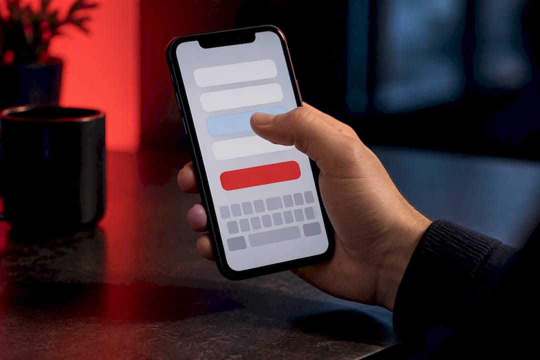
Mobile forms need their own attention. Use the correct input type for each field, type="email" and type="tel" trigger the right keyboard automatically, so visitors aren’t hunting for the “@” symbol on a numeric keypad. Stack fields vertically, make touch targets large, and never make a mobile visitor pinch-zoom to read a label.
Sometimes the best form is no form at all. Click-to-call buttons work well for service businesses where a phone conversation converts better than an email exchange. Calendar-booking widgets skip the “we’ll be in touch” step entirely. Chat flows let a visitor ask a quick question before committing to anything, which can outperform a form for complex or high-consideration offers where a person has one specific concern standing between them and a yes.
Mobile-First Layout and Page Speed: The Launch Checklist
Most landing page traffic arrives on a phone, so design the mobile version first and treat desktop as the expansion, not the other way around. A single-column layout keeps the eye moving in one predictable direction, and the CTA button needs to sit within comfortable thumb reach, generally the lower two-thirds of the screen, not tucked in a top corner a thumb has to stretch for.
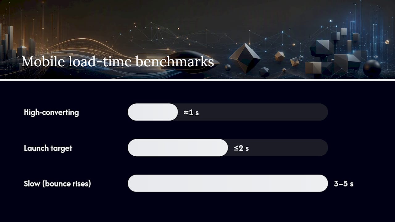
Page speed isn’t a nice-to-have here, it’s a conversion mechanism in its own right. Pages that load in about one second convert meaningfully better than pages that take three to five seconds, and bounce rates climb sharply as load time increases, according to performance research from Neel Networks. Before launch, run through this list:
- Compress and modernize images. Serve WebP format with a
srcsetattribute so phones download a smaller file than desktops automatically. - Lazy-load anything below the fold. Images and embeds the visitor hasn’t scrolled to yet shouldn’t compete for bandwidth with the hero.
- Minimize third-party scripts. Every chat widget, tracking pixel, and font loaded from an external server adds milliseconds that add up fast.
- Test on an actual mid-range phone, not just your own high-end one, since that’s closer to what a chunk of your traffic is using.
- Check your load time with a real tool like Google PageSpeed Insights or GTmetrix before calling the page done.
Aim for a load time close to two seconds or under on mobile, and treat anything past four seconds as a launch blocker, not a future optimization. Courimo’s roundup of mobile marketing ideas covers additional angles on mobile-specific lead generation worth pairing with this checklist.
A/B Testing Your Landing Page: What to Test First
Test one element at a time, and test in a specific order: headline first, then CTA, then form length, then hero visual. This sequence exists because the headline carries the most weight in a visitor’s first impression, so getting it right pays off across every other test you run afterward, a priority order recommended by Unbounce’s testing research.
Changing more than one variable at a time ruins your ability to know what actually caused a lift. If you swap the headline and the CTA color in the same test, and conversions go up, you have no idea which change did the work. Isolate variables even when it feels slower.
Sample size matters more than most marketers account for. A test that only sees 200 visitors total isn’t going to produce a reliable answer, especially for a page with a naturally low conversion rate. Let a test run until each variant has enough conversions, generally at least a few dozen per version, before drawing a conclusion, and resist the urge to call a winner after two good days.
Track these KPIs from day one, not just after launch:
- Conversion rate, the percentage of visitors who complete the goal action.
- Bounce rate, how many visitors leave without interacting at all.
- Time to interactive, how quickly the page becomes usable on a real connection.
- Cost per lead, especially critical if the traffic is paid.
Once a variant wins clearly and consistently, roll it into your baseline and start the next test against that new baseline rather than repeating the same comparison. Testing isn’t a one-time launch task, it’s an ongoing habit that compounds over months.
Landing Page Builders and Templates: DIY or Hire It Out?
Four tool categories cover almost everything you need to build and manage a landing page: page builders for the layout itself, A/B testing platforms for experimentation, form platforms for lead capture and routing, and analytics tools for measuring what’s actually happening after launch. Most modern page builders bundle basic versions of all four, which is enough for a straightforward campaign.
A template is enough when your offer is simple, your traffic volume is modest, and you’re comfortable editing text and swapping images yourself. A template stops being enough once you need custom tracking setups across multiple ad platforms, a design that has to match a specific brand system precisely, or a page that needs to handle serious traffic without breaking under load, situations where speed and technical polish start mattering more than a DIY builder can reliably deliver.
Before picking a starter template, run it against this short checklist:
- Does the template’s structure match your offer type? A demo-request template forces awkward compromises on a newsletter signup, and vice versa.
- Can you edit the mobile layout independently from desktop, or does the template force identical stacking on both?
- Does it support the form fields and integrations you actually need, without requiring a developer to bolt them on?
- Is the base load time already reasonable before you’ve added your own images and scripts?
Courimo’s breakdown of hiring a website development agency to increase leads covers the tradeoffs in more depth for readers weighing DIY against bringing in outside help.
How a Digital Agency Approaches a Landing Page Project
Courimo treats every landing page build as a message-match problem first, before a single wireframe gets drawn. That starts with a discovery brief: what’s the traffic source, what did the ad or email promise, and what’s the one action this page needs to drive. Skipping that step is how agencies end up building a beautiful page that doesn’t match what brought the visitor there.
From there, the workflow moves through a few consistent stages:
- Discovery and message-match brief: confirm the traffic source, the offer, and the single conversion goal before any design work starts.
- Rapid build with QA and tracking baked in: the page gets built with analytics and conversion tracking installed from day one, not bolted on after launch.
- Iteration through A/B testing: changes get tied directly to the KPIs that matter for that specific campaign, with a regular reporting cadence so the client sees what’s improving and why.
That structure exists because a landing page that launches without tracking is a page nobody can improve later, and one built without a clear message-match brief usually needs a costly rebuild within a few months.
SEO Basics That Affect Landing Page Visibility
Landing pages built purely for paid traffic often skip SEO entirely, which is fine if every visitor arrives through an ad. But plenty of landing pages also need to rank on their own, especially service and lead-generation pages that pull in organic search traffic over time.
A few fundamentals matter more than anything fancy. The page title tag and H1 should include the actual term people search for, not a clever tagline that means nothing to a search engine. Meta descriptions won’t directly boost rankings, but a well-written one improves click-through rate from the results page, which matters just as much. Page speed, the same speed that affects conversion, also factors into how search engines rank mobile pages, so the performance work you do for visitors pays off twice.
Alt text on images gives search engines context they can’t get from a picture alone, and it does double duty for accessibility. Clean URL structure, a short readable slug instead of a string of tracking parameters, helps both crawlers and human visitors understand what a page is about at a glance. And because landing pages are single-purpose by design, avoid the temptation to target five different keywords on one page, spreading focus that thin usually means the page ranks weakly for all of them instead of strongly for one.
If organic visibility matters for a given page, treat it as a factor from the first draft, not an afterthought bolted on after the design is locked. Courimo’s guide to ranking a website through search engine optimization covers the fundamentals in more depth for readers building organic-focused pages.
Common Landing Page Mistakes Worth Catching Early
Competing calls to action sink more pages than bad design ever does. A page with a “Buy Now” button, a “Learn More” link, and a newsletter signup form in the sidebar is asking visitors to make three decisions instead of one, and most will make none of them.
Keeping the main site navigation on a landing page is another frequent misstep. That menu is an exit ramp built directly into the page, offering five ways to leave before the visitor has even considered the one thing you actually want them to do.
Weak or generic headlines cost more conversions than almost anything else on the page, because the headline is doing the most work in the least time. “Welcome to Our Website” tells a visitor nothing about why they should stay.
Long forms asking for information you don’t need yet turn a curious visitor into a bounced one, especially on mobile, where every extra field means more scrolling and more typing on a small keyboard.
Ignoring load time is a mistake that compounds silently: nobody complains about a slow page, they just leave, which means the damage often goes unnoticed until conversion numbers are already down.
Vague or unattributed testimonials (“Amazing service, highly recommend!”) do far less persuasive work than proof with a real name and outcome attached, and generic stock photography that doesn’t relate to the actual offer tends to erode trust rather than build it.
The Psychology Behind Why Landing Pages Convert
Social proof works because people look to others’ behavior when they’re uncertain about a decision, and a landing page decision, hand over an email, pay for a trial, is exactly the kind of moment that uncertainty shows up. A specific testimonial with a name and a measurable result taps into that instinct far more effectively than a five-star icon with no context behind it.
Scarcity and urgency work on a similar principle: limited availability or a closing deadline pushes a visitor to decide now instead of “later,” and later is where most abandoned intentions die. The catch is that this only works when it’s true. A countdown timer that resets every time someone revisits the page gets noticed, and once a visitor catches one dishonest urgency cue, they start distrusting every claim on the rest of the page.
Reducing anxiety matters just as much as creating motivation. Microcopy that answers an unspoken worry, “no credit card required,” “cancel anytime,” “we never sell your data,” removes a specific objection right at the moment a visitor’s finger is hovering over the button. And the how-it-works section exists for the same psychological reason: uncertainty about a process feels riskier than the process actually is, and three plain steps usually resolve that feeling faster than any amount of persuasive copy.
Get a Landing Page Built to Convert, Not Just Look Good
A landing page that looks polished but doesn’t match your ad copy, loads slowly on mobile, or buries the CTA below three scrolls of text will quietly bleed leads no matter how good the product behind it is. Landing pages built around principles like message match, minimal friction, and mobile-first speed should treat every build as the start of a testing cycle, not a one-time project that gets forgotten after launch.
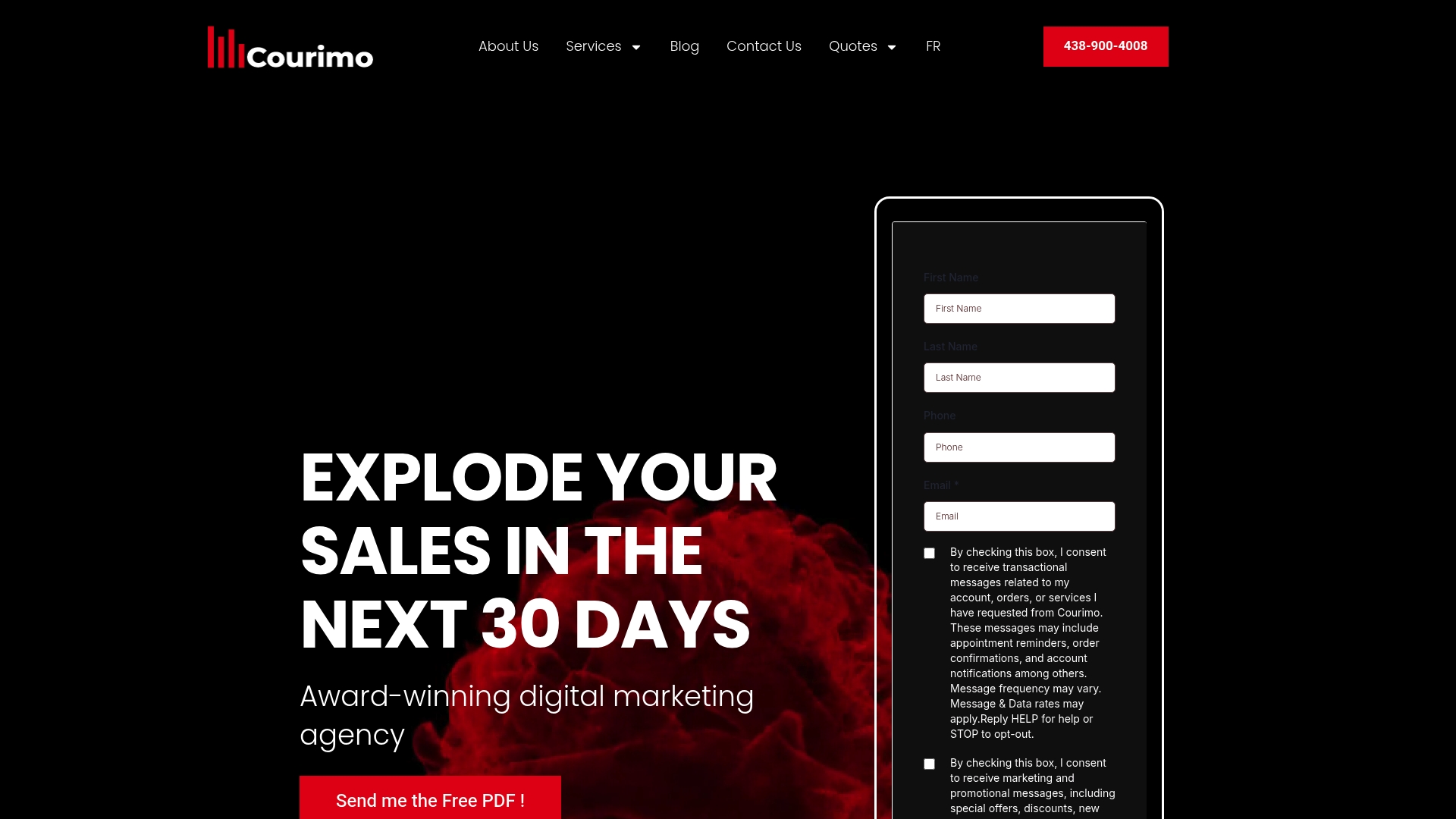
Whether you need a single high-converting page for a paid campaign or a full site rebuild that includes conversion-focused landing pages throughout, Courimo’s website development team handles design, build, and tracking setup as one connected process. If your traffic is coming from paid search, pairing that build with Google Ads management keeps the ad copy and the landing page headline in sync from day one, which is where most campaigns quietly lose money without anyone noticing. Ready to see what a properly built page could do for your conversion rate? Request a free website development quote and get a response within 24 hours.
Test First, Rebuild Only When Testing Can’t Fix It
Most landing page problems don’t need a rebuild, they need a test. A weak headline, a CTA that blends into the background, a form with two fields too many, these are afternoon fixes, not redesign projects. Change the CTA label from “Submit” to “Get My Free Quote” and you might see the lift within a week of traffic.
Reach for a full redesign when the problems are structural: the page is genuinely slow no matter what you compress, it was built on outdated technology that can’t support proper tracking, or the brand itself has changed enough that the page no longer represents what you sell. Budget for a rebuild when testing has plateaued and the ceiling is technical, not creative.
— Ruthwik
Where This Guide’s Data Comes From
The conversion statistics and testing guidance throughout this article draw on a handful of sources worth bookmarking for deeper reading. HubSpot’s landing page best practices covers form-length data and CTA personalization research in detail. Unbounce’s roundup of top landing page examples is worth a scroll for testing methodology and visual inspiration. LanderLab’s complete best-practices guide and Kirro’s data-backed rules both go deeper on message match, form psychology, and proof placement than space here allowed.
Sources
- Landing page best practices — HubSpot
- 40 best landing page examples of 2026 — Unbounce
- High-Converting Landing Page Design: 2026 Complete Guide — Neel Networks
- Landing Page Best Practices: The Complete 2026 Guide — LanderLab
- Landing page best practices: 10 data-backed rules — Kirro
FAQ
What is a landing page in design terms?
A landing page is a standalone web page built around a single conversion goal, stripped of the navigation and competing links a normal site page carries. Its job is to get one visitor type to take one specific action, whether that’s signing up, requesting a quote, or starting a trial.
What is the best way to design a landing page?
Start with message match: the headline needs to echo whatever ad or email brought the visitor there, paired with a visible CTA above the fold. From there, follow a predictable sequence, hero, proof, benefits, how it works, closing CTA, and keep the form as short as the offer allows, since cutting fields from four to three can raise conversions by roughly 50%.
What is the best design layout for a landing page?
A single-column, mobile-first layout tends to outperform multi-column desktop-style layouts, since it keeps attention moving in one direction toward the CTA. Pair that with fast load times; pages loading in about one second convert meaningfully better than pages taking three to five seconds.
Can ChatGPT build a landing page?
ChatGPT and similar tools can help draft headline options, benefit copy, and FAQ answers quickly, which is genuinely useful for the copywriting stage. It can’t handle the technical build, tracking setup, or A/B testing infrastructure a real launch needs, which is where a page builder, a developer, or an agency like Courimo’s website development team takes over.
How much does a professionally designed landing page cost?
Pricing depends on scope, whether it’s a single page or part of a larger campaign or site build, so current rates are best confirmed directly through a quote request rather than a flat number. Courimo offers a free website development quote with a response guaranteed within 24 hours.