Every marketing dashboard should center on five to nine revenue-linked KPIs. CAC, marketing-sourced revenue, conversion rate, ROAS, and LTV form the core, with the exact mix depending on your channel spend. Its job isn’t to display data; it’s to force a decision. Build three tiered views (executive, operating, channel), review the top tier weekly, and drill into channel detail only when a number moves.
TL;DR:
- Focusing on five to nine revenue-linked KPIs, such as CAC, LTV, ROAS, and conversion rate, keeps dashboards clear and decision-oriented.
- Each KPI should have a defined owner, target, and formula, with review cadences tailored to their decision impact, like weekly for operational metrics.
- Structuring dashboards into executive, operating, and channel views prevents clutter and emphasizes the most critical metrics for each audience.
- Prioritize decision-driven KPIs over broad metrics and eliminate vanity or stale data to maintain trust and relevance in reporting.
- Building a reliable data foundation involves connecting core sources, automating calculations, and reconciling against finance to ensure accuracy and trust.
Table of Contents
- Which Marketing Dashboard KPIs Matter Most?
- How Do You Choose the Right KPIs for a Dashboard?
- What Should Each Dashboard View Look Like?
- How Do You Build a Reliable Data Foundation?
- What Do Good Marketing Dashboard Examples Look Like?
- Which Tools Fit Your Team’s Reporting Needs?
- What Are the Most Common Dashboard Mistakes?
- How Courimo Builds and Runs KPI Dashboards for Clients
- Why Decision-First KPIs Beat Metric-Heavy Dashboards
- Get a Working KPI Dashboard Built Around Your Numbers, Not a Template
- Sources
- FAQ
Which Marketing Dashboard KPIs Matter Most?
Not every metric earns a spot on a marketing dashboard. A KPI (key performance indicator) is a number tied to a target and an owner that triggers a decision. A metric is everything else: useful for diagnosis, but not something a VP should see on the main screen. That distinction gets blurred constantly, and it’s the root cause of most cluttered dashboards.
Here are the KPIs worth tracking, with definitions and how to calculate each one.
- Customer Acquisition Cost (CAC): total marketing and sales spend divided by new customers acquired. Owned by growth or performance marketing leads; exec-level KPI.
- Customer Lifetime Value (LTV): average revenue per customer over the relationship, often projected using gross margin and churn rate. Owned by revenue operations; exec-level.
- LTV:CAC Ratio: LTV divided by CAC. A ratio above 3:1 generally signals healthy unit economics. Exec-level.
- Return on Ad Spend (ROAS): revenue generated divided by ad spend. Owned by paid media managers; channel-level, rolls up to exec view.
- Marketing-Sourced Revenue: closed-won revenue where marketing touched the first or last interaction. Owned by demand gen; exec-level.
- Conversion Rate: conversions divided by total visitors or leads, expressed as a percentage. Owned by CRO or web teams; both exec and channel level.
- Cost Per Click (CPC): ad spend divided by clicks. Owned by paid media specialists; channel-level diagnostic.
- Click-Through Rate (CTR): clicks divided by impressions. Channel-level diagnostic, useful for creative testing.
- Lead-to-Customer Conversion Rate: closed customers divided by total leads generated. Owned by sales and marketing jointly; operating-level.
- Marketing Qualified Leads (MQLs): leads meeting a defined scoring threshold. Owned by demand gen; operating-level.
- Churn Rate: customers lost divided by total customers over a period. Owned by customer success, but marketing tracks it to protect LTV assumptions; exec-level.
- Website Traffic (Organic and Paid): sessions segmented by source. Owned by SEO/content leads; channel-level diagnostic.
- Engagement Rate: interactions divided by reach, applied to social or email. Owned by content or social managers; channel-level.
- Email Open and Click Rates: opens or clicks divided by delivered sends. Owned by lifecycle marketing; channel-level.
- Pipeline Velocity: how fast leads move through funnel stages, measured in days. Owned by revenue operations; operating-level.
Most research on marketing KPIs consistently names CAC, LTV, ROAS/ROI, and conversion rate as the non-negotiable core. Start with items 1 through 6 as your headline set. Everything else belongs one click deeper as a diagnostic, not on the front screen where an executive glances for ten seconds.
How Do You Choose the Right KPIs for a Dashboard?
Pick KPIs by working backward from decisions, not forward from available data. That’s the single biggest mistake teams make: they build a dashboard around whatever their tools happen to export, then wonder why nobody looks at it after week two.
Start with the five decisions your team actually makes on a recurring basis. Should we increase spend on this channel? Is this campaign profitable enough to renew? Is our funnel leaking at a specific stage? Is churn eating into our acquisition gains? Should we reallocate budget between channels? Every one of those decisions maps to a specific KPI, and if a metric doesn’t map to a decision, it’s decoration.
A useful structure to work from:
- Cap each dashboard view at five to nine metrics; a HubSpot analysis of KPI dashboard best practices found that anything beyond that range dilutes attention rather than adding clarity.
- Assign one owner per KPI. If two people think they’re responsible for CAC, nobody actually is.
- Set a numeric target for each KPI, not just a direction. “Increase conversion rate” is not a target. “Conversion rate above 3.2% by end of quarter” is.
- Write a metric dictionary that defines the exact formula, data source, and attribution window for each KPI, so “conversion rate” means the same thing in every meeting.
- Set a review cadence per KPI tier: weekly for operating metrics, monthly for exec-level trends, and real-time alerts for anything that could signal a budget-burning problem.
Pro Tip: Run a “would this change what we do?” test on every KPI candidate before it makes the dashboard. If the answer is no, it’s a diagnostic metric, not a headline one, and belongs on a drill-down screen instead.
What Should Each Dashboard View Look Like?
The hub-and-spoke model solves the most common dashboard failure: trying to cram everything into one screen. You build one executive hub and multiple channel spokes, and each has a distinct job.
The executive view centers on revenue and efficiency: marketing-sourced revenue, CAC, LTV:CAC ratio, and overall ROAS. Nothing else. This is the screen a CMO or CEO checks in under a minute.
The operating view sits one layer down and covers lead volume, MQL-to-customer conversion, pipeline velocity, and channel-level ROAS. This is where marketing managers and directors live day to day.
Channel views break out further into paid search, paid social, email, and organic performance, each with its own CPC, CTR, and engagement metrics.
Visual hierarchy matters as much as metric selection:
- Revenue and efficiency numbers go top left, in the largest cards, since that’s where eyes land first.
- Trend lines (week over week, month over month) sit second, giving context to whether a number is good or just normal.
- Channel breakdowns and granular tables go lowest, reserved for people actively troubleshooting.
- Use alert badges or color flags sparingly, and only on numbers that would actually trigger action if they moved.
How Do You Build a Reliable Data Foundation?
A dashboard is only as trustworthy as the pipes feeding it. Build in this order: collection, then a metric layer, then automation, then alerts and delivery. Skip a step and you end up manually reconciling spreadsheets every Friday, which is how most marketing dashboards quietly die.
- Connect your core sources first: CRM (HubSpot, Salesforce), ad platforms (Google Ads, Meta), web analytics (Google Analytics), email platform, and your payment or billing system for actual revenue data.
- Land everything in one place: a warehouse or a BI tool’s native connectors, so metrics aren’t calculated differently in five different exports. The recommended build order is sources into one location, agreed definitions, then the funnel spine, then efficiency and channel layers on top.
- Automate the calculations, not just the data pulls. If CAC is being computed by hand in a spreadsheet each month, someone will eventually make a rounding error that undermines trust in the whole dashboard.
- Reconcile against finance monthly. Marketing-attributed revenue should roughly match what finance reports as closed revenue; large gaps usually mean an attribution window or definition problem.
- Schedule a quarterly audit to catch broken connectors, renamed campaigns, or metrics nobody has looked at in three months.
Pro Tip: Reconciliation is where most attribution disputes get resolved. If your dashboard says marketing drove $80,000 in revenue and finance’s numbers show $50,000, don’t argue about the dashboard, check the attribution window first.
What Do Good Marketing Dashboard Examples Look Like?
Four dashboard types cover most marketing teams’ needs, and each has a different audience and cadence.
- Campaign performance dashboard: impressions, CTR, CPC, conversion rate, cost per lead, and ROAS. Reviewed weekly by paid media managers, sometimes daily during active launches.
- Lead funnel / operating dashboard: MQLs, lead-to-customer rate, pipeline velocity, and cost per MQL by channel. Reviewed weekly by marketing managers and shared biweekly with sales leadership.
- Email and content dashboard: open rate, click rate, content-attributed revenue, and organic traffic by page. Reviewed biweekly by content and lifecycle teams.
- Executive overview: marketing-sourced revenue, CAC, LTV:CAC, and blended ROAS. Reviewed monthly, presented in under five minutes, with drill-down links rather than raw tables.
Rather than building from a blank canvas, start from an existing blueprint. Amplitude’s digital marketing dashboard template is a solid reference point for structuring tiles before you customize for your own funnel.
Which Tools Fit Your Team’s Reporting Needs?
Tool choice should follow your data complexity, not the other way around. Buying an enterprise BI platform before you’ve defined your KPIs is how six-figure software budgets turn into unused licenses.
- Free connector tools like Looker Studio work well if most of your data already lives in Google Ads, GA4, and Google Sheets, and your team is small enough that manual refreshes aren’t a burden.
- Lightweight dashboard platforms such as Databox suit growing teams that need automated refresh across multiple ad platforms and CRMs without a dedicated analyst.
- Enterprise BI platforms like Tableau or Power BI make sense once you have a data warehouse, multiple business units, and someone whose job is dashboard governance.
Judge any tool on four criteria: how many native connectors it has for your stack, how fast it refreshes, what it costs at your data volume, and whether one person can manage user access without becoming a full-time job. Automated, centralized reporting beats manual spreadsheet stitching regardless of which platform you pick.
What Are the Most Common Dashboard Mistakes?
Five failure patterns show up in almost every broken dashboard, and each has a fast fix.
- Vanity metrics on the executive view (raw impressions, follower counts) crowd out revenue numbers. Fix: move them to a channel-level spoke.
- Inconsistent definitions across teams cause meetings to devolve into “whose number is right.” Fix: a shared metric dictionary with one designated editor.
- Stale data from broken connectors erodes trust fast. Fix: automate collection and set connector health alerts.
- No assigned owner means a KPI trending badly goes unnoticed for weeks. Fix: one name per metric, no exceptions.
- Tile overload turns a decision tool into a wall of noise. Fix: archive anything unused for 90 days.
Before launch, confirm every KPI has a formula, an owner, a target, and a reason it triggers a decision.
How Courimo Builds and Runs KPI Dashboards for Clients
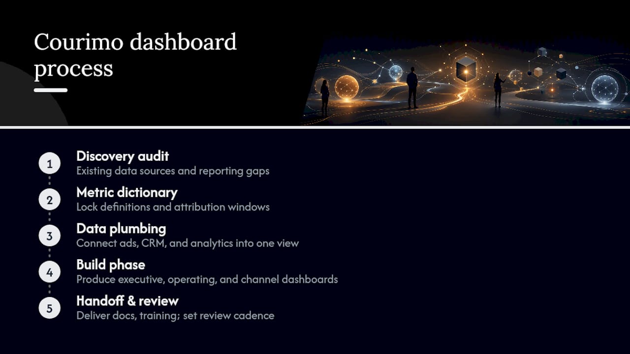
A typical dashboard process runs in four stages: a discovery audit of existing data sources and reporting gaps, a metric dictionary that locks in definitions and attribution windows, the data plumbing to connect ad platforms, CRM, and analytics into one view, and a build phase that produces executive, operating, and channel dashboards. Handoff includes a review cadence so the dashboard gets used, not archived.
Clients typically get a working dashboard, documented KPI definitions, and a short training session on reading and updating targets. Quick wins tend to surface in the first reporting cycle, once inconsistent numbers across platforms get reconciled into one source of truth.
Why Decision-First KPIs Beat Metric-Heavy Dashboards
The conventional advice on marketing dashboards is to track “everything important.” That’s backward, and it’s why so many dashboards get built once and opened twice. The teams that actually use their dashboards start with the decision, not the data source.
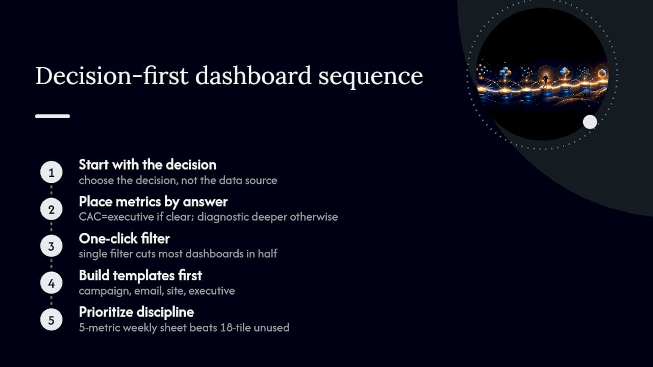
If there’s a clear answer, CAC belongs on the executive view. If the answer is “we’d look into it,” it’s a diagnostic metric, and it belongs one click deeper. That single filter would cut most dashboards in half.
The other overrated habit is chasing dashboard sophistication before dashboard discipline. A five-metric spreadsheet reviewed every week beats an eighteen-tile enterprise dashboard nobody opens. Build the templates first: campaign, email, site, executive. Get people using them. Only then does it make sense to invest in heavier tooling or additional tiers. Sequence matters more than software here, and most teams get that order backward.
— Ruthwik
Get a Working KPI Dashboard Built Around Your Numbers, Not a Template
Most marketing teams don’t need more data. They need one dashboard that tells them what to do next, built around their actual revenue numbers instead of whatever a template happened to include. Courimo builds that dashboard as part of its Google Ads (PPC) and SEO engagements, wiring campaign, funnel, and revenue data into views your team will actually open.

A discovery call typically covers your current data sources, the decisions your team makes weekly, and where your existing reporting breaks down. From there, a proposal is typically put together within 24 to 72 hours, scoped to specific KPIs and platforms rather than a generic package. If your current reporting can’t answer “should we increase spend on this channel,” start with a website development or SEO quote and get your KPIs mapped to a dashboard someone actually checks every Monday.
Sources
- KPI dashboards & how to use them in your marketing | HubSpot
- Marketing team dashboard in Metabase (metrics & example) | Metabase
- Marketing KPI Dashboard: Build One That Works | ObserviX
FAQ
What KPIs Should My Marketing Dashboard Track?
A working dashboard should track five to nine headline KPIs: CAC, LTV, LTV:CAC ratio, ROAS, marketing-sourced revenue, and conversion rate, with channel-specific metrics like CTR and CPC kept as diagnostics one layer below.
What Are the 5 Key Performance Indicators in Marketing?
Definitions vary by team, but the five most commonly cited across marketing KPI frameworks are CAC, LTV, ROAS or ROI, conversion rate, and marketing-sourced revenue.
What Are Some Examples of Marketing KPIs?
Examples include customer acquisition cost, click-through rate, cost per click, email open rate, lead-to-customer conversion rate, and churn rate, each tied to a specific owner and target.
What Are the KPIs for Digital Marketing?
Digital marketing KPIs typically split into acquisition metrics (CPC, CTR, CAC), conversion metrics (conversion rate, MQLs), and retention metrics (LTV, churn rate), organized across campaign, channel, and executive views.
How Many KPIs Should a Marketing Dashboard Have?
Cap each dashboard view at five to nine metrics for readability, though a full tiered framework across revenue, pipeline, and channel layers can total 12 to 18 KPIs organized across multiple views.